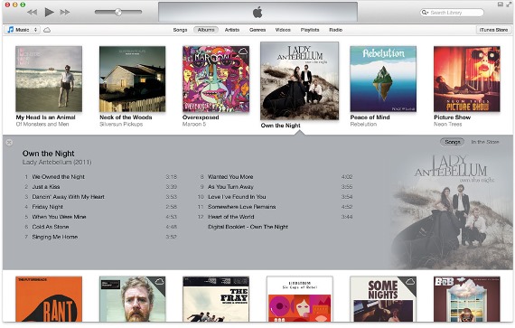
When everything else under the sun seemed to have changed, it kept us wondering why Apple hasn’t changed iTunes in ages. The long awaited iTunes 11 is finally out. What to expect from it, just a slightly different interface with a new color or an entirely pleasing look and feel? We have broken down the details into 11 parts to help you catch a good glimpse of what it will be like to use the new iTunes 11.
What to Expect in iTunes 11
Welcome Note
iTunes 11 welcomes you with the offer to access your library in order to give you more information on the songs or media you’re watching. You can also choose to keep it private, but giving it access will get you more information like album covers, artists, and so on.
Sidebar
The traditional sidebar is missing and you have a dropdown button which will give you a list of the media types. However, you can restore the sidebar if you want the old experience. You can go to the iTunes store almost instantly by clicking the button on the right side of the menu bar.
Playlist
It reminds me of the Windows Media Player. Clicking on the Add To button opens a sidebar-like panel with the playlist. You can just drag and drop the songs you want from the main screen.
Connected Devices
As you no longer have the sidebar, the devices that are connected will not be displayed. Instead, when you connect more devices, it will give the same access and synchronize all the files on your iOS devices.
Artists
The page that gives you information on artists is laid out clean and clear. You will find every bit of information you will need to know on this page, but sadly, you can’t customize the look of this page.
Up Next
It is a new feature of iTunes 11. It gives you a list of the songs that will be played and you can also add more songs to the list. You can also find out what you’ve already listened to, by clicking on the clock icon.
iTunes Store
The iTunes store has got a completely new look and its desktop version looks as cool as the iOS version. The icons are bigger in size giving you a better look of the posters and album covers. The interface also displays information on other songs or items that you may consider purchasing.
Album View
The album view has become a more useful feature. Clicking on a thumbnail will display all the songs in the album and you can also find a small iCloud button letting you to download the song if you don’t have a copy of it. You can also add the songs to Up Next or playlists directly from this panel.
Mini Player
The mini player now includes search, playlist and Up Next features making it helpful.
Song View
The song view in iTunes 11 has also got an inflexible layout. However, you can find all the details laid out clearly.
Context Menu
It is hidden behind a small button next to the songs. Clicking on the button will open a menu from which you can add the song to a playlist or the Up Next list. You can also choose to play the song after the current song, from this menu.
There have been quite many changes in iTunes 11, but it’s not difficult to grasp all of them at once as they have only made the experience easier and more enjoyable.
Download iTunes 11 here.
Author Bio: George Webber is a freelance writer who writes about the latest in Entertainment, Social Media and Technology. Currently writing for www.1800cabletv.com – your gateway to the best deals on cable tv and Internet or Phone services.


Leave a Reply