Want to turn website visitors to converting customers month on month?
You need a perfectly designed landing page that can capture your readers attention and convince them to make a purchase?
Go to your website right now and take a look at your landing page!
Are you convinced that your landing page is powerful enough to turn your casual website visitors into converting customers?
No?
Then one of the key areas that you need to focus on is making your landing pages convert.
Studies like this one indicate that only a small percentage of businesses are satisfied with their conversion rates. If you are one such business, then here’s how you can improve your landing pages to drive more conversions.
How to Turn Website Visitors to Converting Customers
Strategy 1: Keep It Simple
Tommy Walker, the former editor of ConversionXL points out in this well written article why simple websites are scientifically better (based on some case studies).
And if that rings true with websites, it rings all the more true with landing pages.
If you dump everything you know about your product on your landing page, you’ll end up with a lot of frills, enough to distract and confuse your visitors.
The simpler the landing page, the better.
Thrive Landing Pages bring out this concept of simplicity quite well.
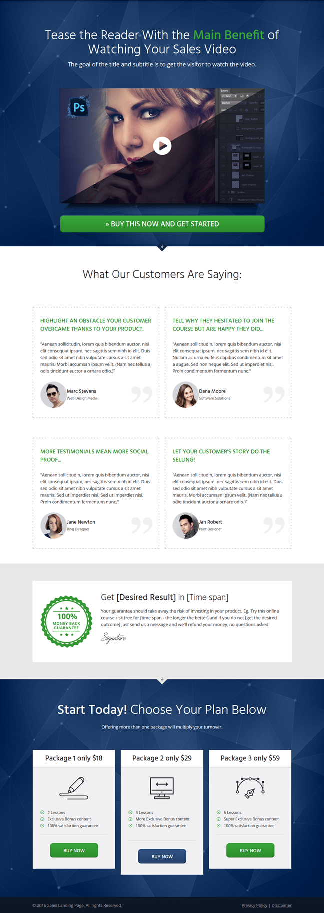
Take a look at this example from one of their landing pages:
Gorgeous Yet Straightforward, right?
This landing page clearly wants you to do one thing and one thing only: Get Sales!

Put yourself in the shoes of your website visitors. There is no doubt in your mind what your next action should be.
- If you are browsing the web to buy a product, you’ll click the green call to action button.
- If you want to know a little bit more about the product before you spend your money, you’ll watch the video and what others are saying and if you’re convinced, you’ll hit the call to action buttons below.
Either way, this landing page has got you hooked.
Why? Because this is a clean, minimalist landing page that has 0% clutter and 100% focus on objective to make the conversion happen.
By avoiding complex and excessive emphasis, you can help your visitors to stay focused on the benefits of the product, which is a surefire way to boost conversions.
If your landing page is stuffed with too much information, you need to rework it to keep it minimal.
Strategy 2: Use the 5-Second Rule
Today, you only have about 5 seconds to convince readers about your web offerings. Just 5 seconds.
If you want to engage your visitors in that 5 seconds, you need to get straight to the point.
How do you achieve this?
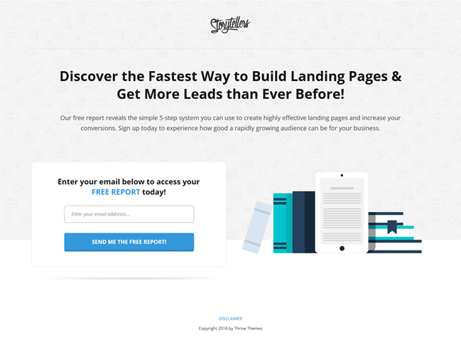
Again, by taking a minimalist approach. In the landing page example below, there are just 2 sentences (title and subtitle) that promises visitors they will discover how to create great landing pages to increase conversions. And its all above the fold, so the visitor doesn’t have to scroll up and down. Plus, it offers room for adding an attractive image, and a CTA.

So if you were to click on this page from the Google Search results.
It would take you about 5 seconds to decide whether to sign up for this report or not. You’ll see that this page offers the dire information you need to help you get more leads; you can see that the report is free, as highlighted in blue, and a convincing image is all is needed to sign up.
That’s the power of a good landing page! All it needs is 5 seconds to convince your visitors.
Test the 5 second rule on your landing page and make the desired changes if it doesn’t pass the test.
Strategy 3: Speed Up the Load Times
In his Kissmetrics blog, Neil talks about how page speed affects conversion rates. The slower your page loads the lesser the conversions.
That’s where the first 2 points are critical. Visitors should get the gist of what you are offering and understand its benefits all in 5 seconds.
If your landing page is slow to load, you’ve already lost them.
Check if your landing pages are slow! If they are, you need to fix them right away.
Strategy 4: Use Plenty of White Space
Today’s website visitor has no time to read paragraphs and paragraphs of content, extolling the virtues and benefits of your product. As you should be convinced of, thanks to the 5 second rule.
One way to emphasize this is by using more white space.
According to Smashing Magazine, a study (Lin, 2004) found that a good splattering of white space between paragraphs as well as in the left and right margins increased comprehension by almost 20%.
White spacing makes it easy for the brain to analyze and process information and make it easy for the brain to decide on the next process – the decision to convert.
Take a look at your landing page and see if there is enough white spacing at the left and right margins and between paragraphs. If you don’t have enough white space, fix it.
Strategy 5: Use Social Proof
As humans, we are all easily influenced by others. If we need convincing, we look to social channels for proof.
In fact, sometimes, that’s all it takes to convert someone who’s on the fence.
Including testimonials in your landing page is one of the easiest ways in which you can make than conviction possible. If you added the logos of companies that used your product or prominent blogs or bloggers who had something powerful to say, it will go a long way in converting casual visitors to customers.
As you can see in the first image, this landing page offers a powerful, yet easy to use testimonial feature in an eye catching and scannable block that makes convincing easy.
If your landing page lacks social proofing, start adding some now.
Strategy 6 – Be Easily Accessible
While some visitors are easily convinced with your focused keywords and images, there are others who are willing to part with their money only if they are convinced you are genuine and not some sneaky con guy.
One of of doing this is including your contact information on your landing page.
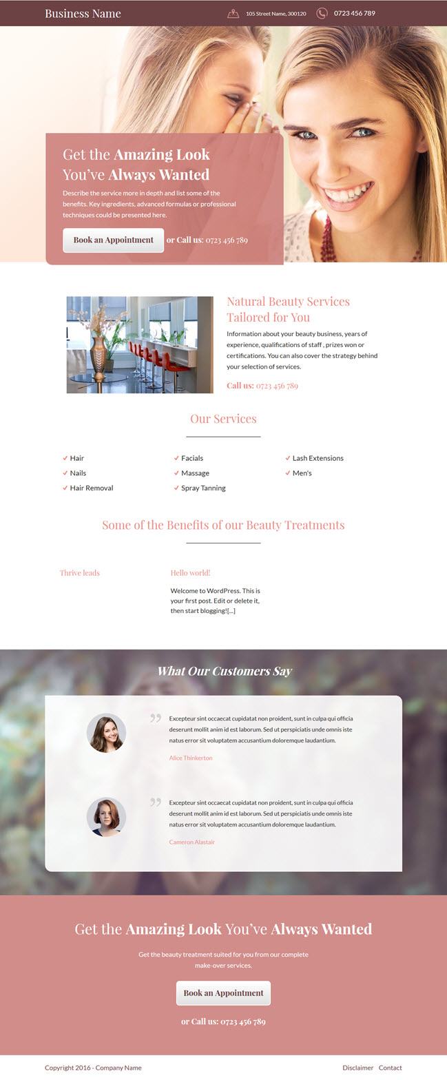
This business themed Thrive Landing Page clearly lays out the contact information right at the top so if anyone wants to visit your office or call you up, they can do it right away.

Adding your contact details lets your visitors know that you are a legitimate business, you have a physical business office location, assuring them of your genuineness and strengthening your chances of making conversions.
Strategy 7: Add Videos
Interactive elements play a big role in conversions. Instead of just adding an image and text, having a short video can convince readers about the significance and usefulness of your product.
If you go back to the first landing page I showcased, you can see how you’re instantly drawn to the video and want to click on it. Again, keeping it brief and creating a personal connection to your visitors via the video can greatly increase conversions.
If you can make a personal connection with your website visitors via video, add that to your landing page.
Conclusion
Landing page optimization doesn’t have to be complicated and expensive. It doesn’t even have to be time consuming to get in the mind of your customers and figure out how to satisfy their wants.
Setting up your landing pages using the strategies outlined above can bring in those much needed conversions.
If you want a shortcut approach to doing all of this, Thrive Landing Pages are worth noting. They take all the fuss out of designing a landing page by incorporating all of the key successful elements I mentioned in this article.
Whether you want to add your contact details, or include images, videos or snazzy headlines, all with plenty of white space around, you can do it at the click of a button. The only tough decision you’ll need to make is choosing a landing page that’s apt for your product.
If you want to build a powerful landing page that can turn website visitors to converting customers, consider the Thrive Content Builder plugin, which includes tons of landing pages optimized and easily customizable for your business.
And if you’ve been using Thrive Landing Pages, share with us any specific element or technique you found to be effective.
Leave a Reply